The Lithosquare case: an integrated approach to design at the service of an innovative brand image
Discover how mprez and its network of partners redesigned the image of Lithosquare, giving birth to a coherent and inspiring brand through an integrated approach to design, web and video.

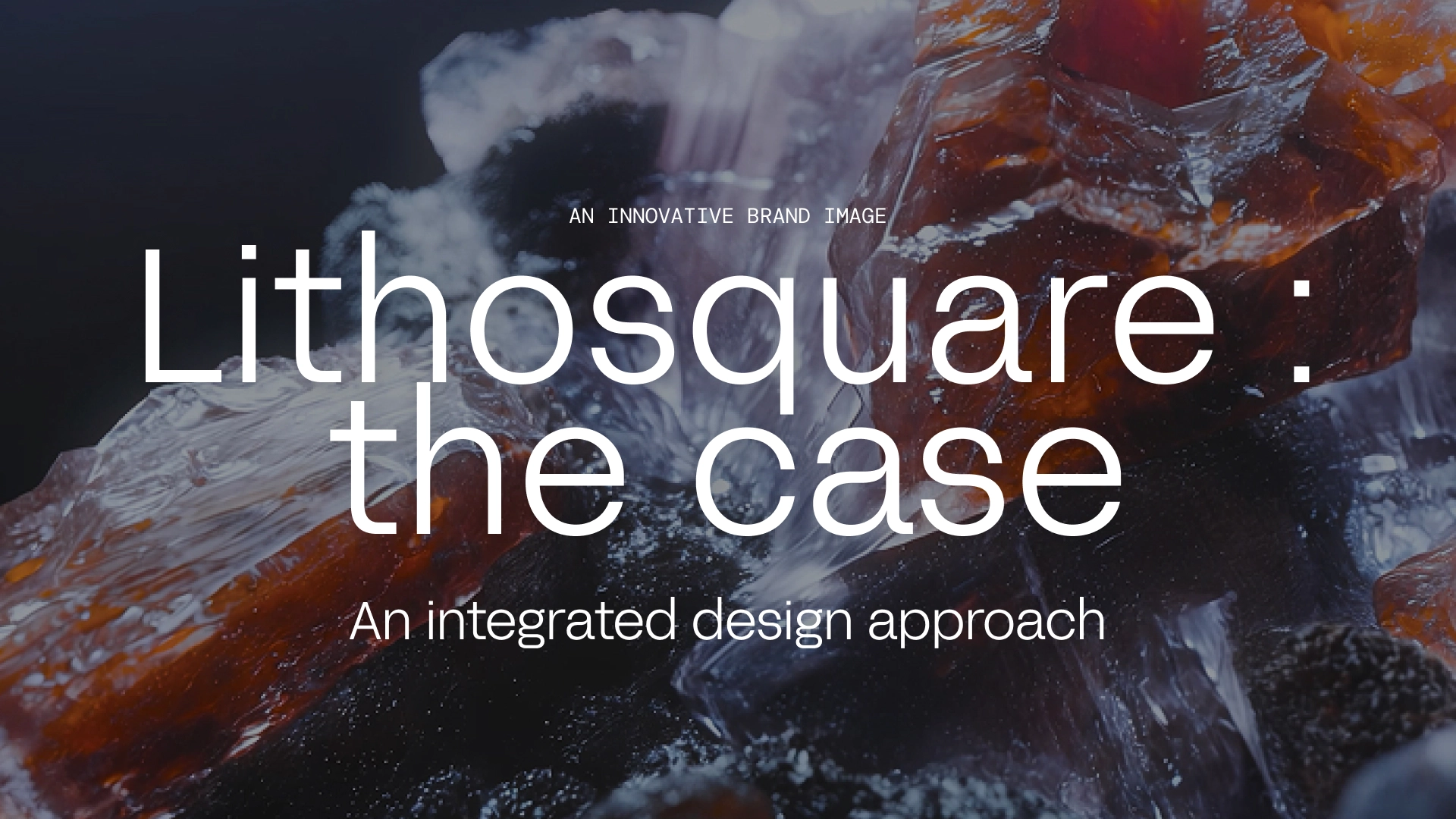
When Lithosquare decided to redesign its image, the challenge went beyond that of simply creating a logo: it was about create a brand image capable of translating the power of an unprecedented technology.
Mprez then put together his ecosystem of trusted partners to pilot a global rebranding, from concept to final production: a project where design, web and video revolve around the same creative vision.
The challenge: to transform promising technology into an inspiring brand
An actor at the crossroads of AI and geology
Lithosquare has developed artificial intelligence technology capable of analyzing geological data to identify geographic areas with high mining potential.
At the crossroads of scientific innovation and a vision rooted in the field, the company wanted to rethink its image in order to better reflect the power of its technology and to assert its uniqueness in a rapidly expanding market.
A global rebranding led by the PowerPoint Mprez agency
To meet this challenge, Lithosquare turned to Mprez, an agency that is historically recognized for its expertise in strategic presentation design and its ability to visually structure a brand speech.
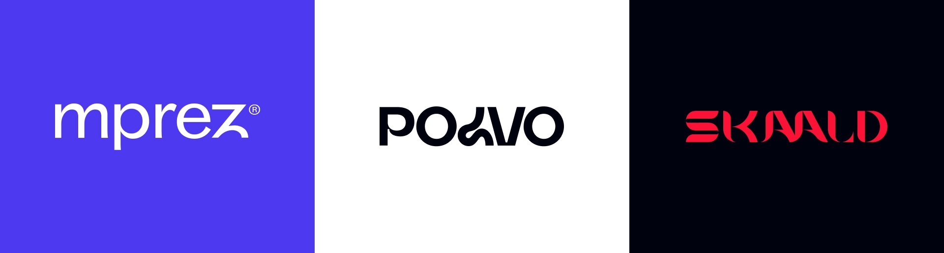
Building on this experience, the agency was able to lay the foundations of this new identity and bring together the most relevant expertise to create a coherent visual universe: Skaald for web design and Polvo for the video.
Instead of piloting the project alone, Mprez played a role of catalyst, infusing the artistic direction and the collective dynamic that made it possible to align all the teams around the same vision.
The objective: create a clear, legible and consistent brand, capable of expressing both the technicality of the product and the depth of the Lithosquare vision.
An agile and aligned creative ecosystem
Mprez relies on a network of trusted partners with whom she collaborates regularly, Skaald for the web and Polvo for the video, each bringing their expertise in a logic of complementarity.
These studios share the same culture of detail and the same requirement: to design strong visual experiences, where content and form advance together.
Ce network operation promotes agility and coherence: each actor maintains his autonomy while evolving within a common creative framework.
The result: a project carried out with fluidity, rigor and flawless aesthetic coherence, the signature of the Mprez model.
A rhythmic and structured way of working
From the start, the collaboration was organized around clear and shared management between the various teams.
On the Lithosquare side, Pauline Villeneuve ensured the overall coordination of the project, while Mprez laid the creative framework and the foundations of the brand identity.
Once this base was defined, each partner took over in their field, Skaald for web design and Polvo for video, while remaining aligned with the common artistic direction.
Regular framework meetings and then dedicated points per cluster made it possible to move forward in a fluid, rapid and structured manner. This agile organization, based on trust and complementarity, made it possible to deliver an ambitious project in a framework that is at once clear, creative and collaborative.
A visual identity born from the encounter between material and data
From strategic thinking to graphic design
From the first discussions, a conviction was established: the identity of Lithosquare had to translate the encounter between soil science and the power of artificial intelligence.
The company evolves in a world where data is used to read matter, and where technology reveals what the human eye does not yet perceive. It's this tension between mineral and digital, between Earth and algorithm, which Mprez has chosen to transform into a visual language.
Three creative paths were first explored: a very technical approach, a second more sensory and mineral approach, and a third rooted in the world of AI.
Over the course of workshops and iterations, the second version emerged: a visual territory inspired by geology, built around a modular grid recalling soil strata as well as data meshes.
This graphic principle has become the backbone of identity, both rigorous and organic, scientific and aesthetic. It laid the foundations of a visually unique brand, capable of embodying technological precision without losing the depth of reality.
It was this common thread that then guided the entire project: the branding, the website and the opening video, all linked by this same idea of structure and material.
A charter designed for the digital ecosystem
Once the visual universe was established, Mprez gave shape to this vision through a Graphic charter complete, designed from the start to live on all media, from the presentation to the website, including the video.
The challenge was twofold: maintaining the coherence of the visual language while leaving each media its own margin of expression.
The logo, deliberately simple and legible, lays the foundations for a precise and controlled brand. Around it, a system of modular forms takes up the principle of the grid and becomes a composition tool that can be adapted to infinity.
La color palette, inspired by minerals, plays on the contrasts between deep tones and brighter shades, creating a balance between technicality and warmth.
Finally, the typography, fine and geometric, reinforces this impression of order and accuracy.
This charter is quickly which has become the common base for all stakeholders : a reference shared by the web and video teams, who were able to rely on this solid framework to develop identity without ever betraying its spirit.

3D video as a gateway to the brand's universe
A visual story more than a demonstration
Produced by Polvo, the opening video designed for Lithosquare does not seek to explain, but to make people feel. Designed like a real visual manifest, this twenty-second 3D sequence plunges the viewer into a universe where Mineral matter meets technology.
Instead of describing the product, the video focuses on evoke the essence of the brand : textures that transform, slow and precise movements, light that reveals more than it exposes. Each shot becomes a metaphor for the role of Lithosquare, Making the invisible visible, explore the depth of reality through the precision of data.
Singular inspirations
To imagine this video, Polvo was directly inspired by the raw material on which Lithosquare works: the textures, the reliefs, the contrasts of the rock. In addition, more artistic and sensitive references were added, in particular the contemplative world of gaming. Death Stranding, known for its minimalist aesthetic and its almost cinematic staging of nature and technology.
From this combination was born a poetic visual interpretation, both dense and airy, where each movement seems to tell a story.
The result is an immersive and timeless creation, faithful to the spirit of the brand, and strong enough to be used on other media, from digital to social networks, to corporate communications.

Bringing the new identity to life through the website
An immersive and coherent experience
The website, designed by Skaald, a partner studio of the mprez network, had the mission of translating the visual identity imagined beforehand, while revealing the technological dimension of Lithosquare.
An additional challenge: the content was deliberately restricted, as the company wanted to get to the point. It was therefore necessary to build a site that was both simple and embodied, capable of expressing the brand more in terms of form than in terms of quantity of information.
The designers have chosen to rely on the modular grid derived from branding, which naturally structures the space and gives the site its visual rhythm.
The compositions play on the Empty and full, about breathing between blocks, typography and image, to create a sense of balance and precision.
The navigation, deliberately refined, highlights legibility and fluidity, an experience without superfluous, where every detail reinforces the perception of a brand that is at once innovative, methodical and demanding.
Seamless integration between web, video and identity
As soon as the site was opened, the 3D video imagined by Polvo emerged as a central element of the experience. Placed in the hero section, it immediately captures the attention and immerses the user in the visual universe of Lithosquare.
Its slow, almost contemplative movement, between matter and light, naturally extends the artistic direction posed by Mprez.
Around her, the design of the site uses the same visual language: the typography, the structure, the animations, any dialogue with the video and reinforces this impression of a perfectly mastered whole.
The result: a continuous and immersive brand experience, where each medium seems to flow from the previous one, without breakage or dissonance.
A collaborative model that proves its worth
A unified artistic direction for tangible benefits
From the creation of the logo to the launch of the site, all deliverables have extended the artistic direction defined by Mprez, ensuring a natural continuity between design, web and video.
This common base allowed Skaald and Polvo to move forward independently while remaining perfectly aligned.
The result: a clear, homogeneous and controlled brand, where each medium is part of the same visual language.
This coherence has resulted in a distinctive identity, a fluid user journey and a perfectly coordinated production between the three poles.
A network of partners that works
This project is a perfect example of collaborative model by mprez: a network operation, where each partner brings its expertise while being part of the same creative vision.
Rather than a juxtaposition of skills, it is a true ecosystem of trust which was set up between Mprez, Skaald and Polvo, each progressing with agility within its perimeter while remaining connected to the others.
This complementarity, based on the clarity of the role of each and on simple communication, made it possible to obtain a final result consistent, fluid and demanding, just like the Mprez model itself.

The final word
This project fully embodies the philosophy of Mprez : create strong brands thanks to a clear artistic direction and a network of trusted partners, able to work together in perfect coherence.
With Lithosquare, this integrated approach has resulted in a innovative, modern and coherent brand, where each medium, from branding to video, tells the same story: that of a company that brings science, design and innovation together.
At mprez, we help brands strengthen their image and impact through compelling presentations, our historical specialty.
But above all, we know manage complete brand projects, by surrounding ourselves with expert partners (web, video, motion) to guarantee consistent, ambitious and measurable results.
Do you want to change your image? Contact us via the dedicated form.